Mingei Fundamentals Book

The purpose of this project was to experiment with the type fundamentals: scale, value, axis, graphic elements, and image. I was tasked with making five different designs for each section. When moving to a different fundamental the designs would get more explorative.
The purpose of this project was to experiment with the type fundamentals: scale, value, axis, graphic elements, and image. I was tasked with making five different designs for each section. When moving to a different fundamental the designs would get more explorative.
The purpose of this project was to experiment with the type fundamentals: scale, value, axis, graphic elements, and image. I was tasked with making five different designs for each section. When moving to a different fundamental the designs would get more explorative.
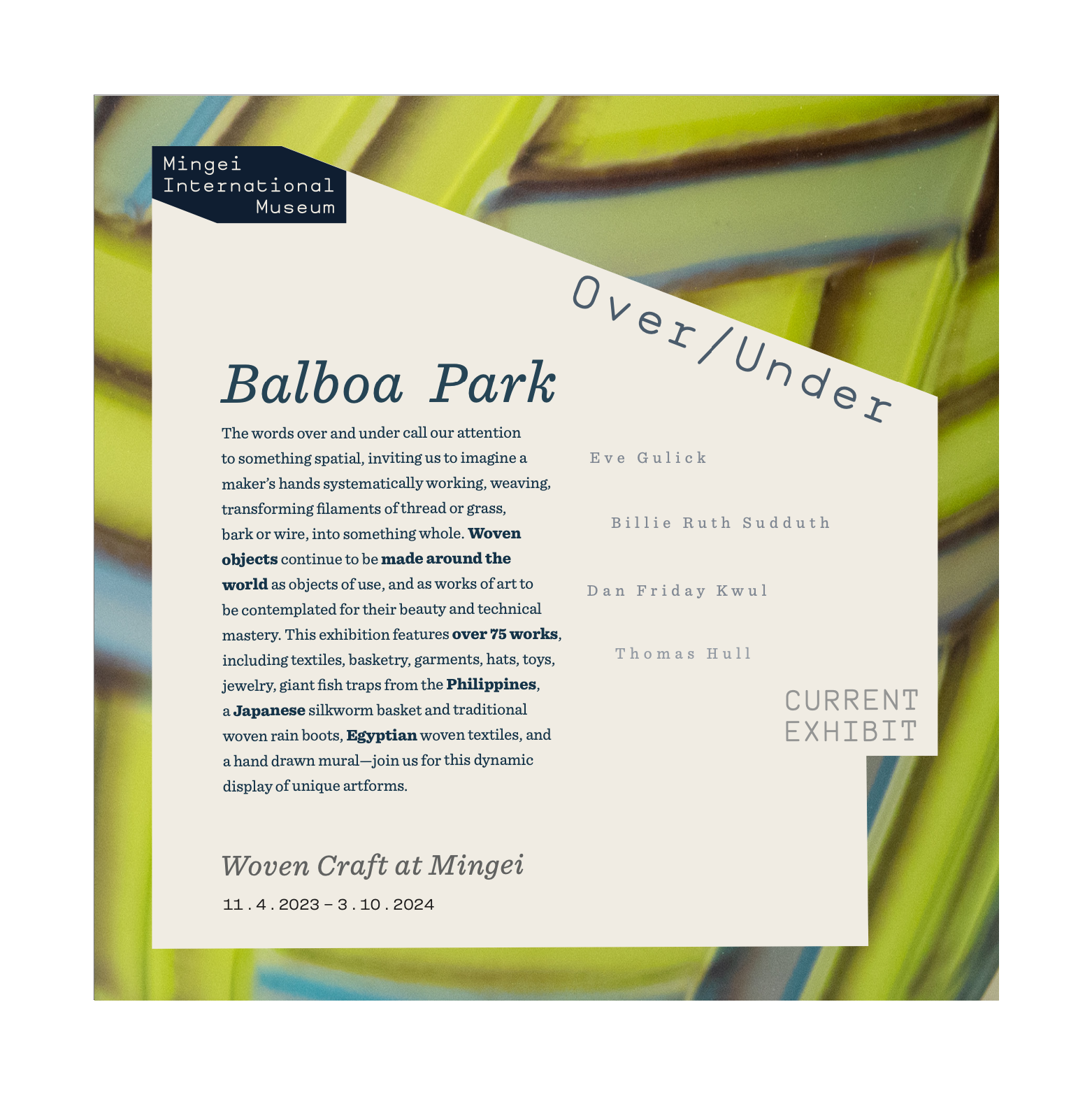
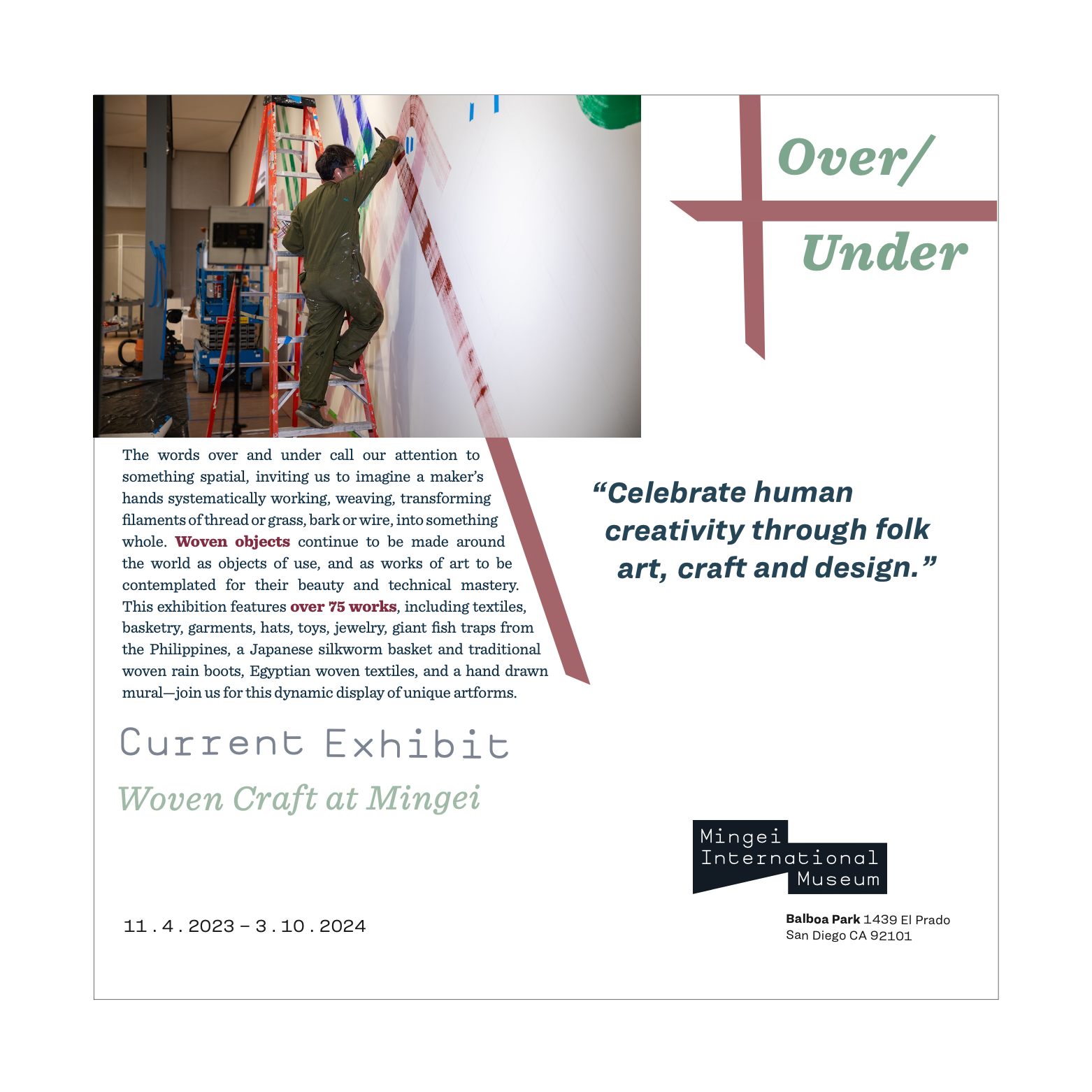
With a focus on the “art of the people” (Japanese: mingei) from all eras and cultures, the Mingei International Museum offers exhibitions and diverse community and educational programs to inspire visitors and celebrate creativity. Previous exhibitions have ranged from displays of functional Japanese ceramics and indigenous baskets to whimsical international folk toys and miniatures.
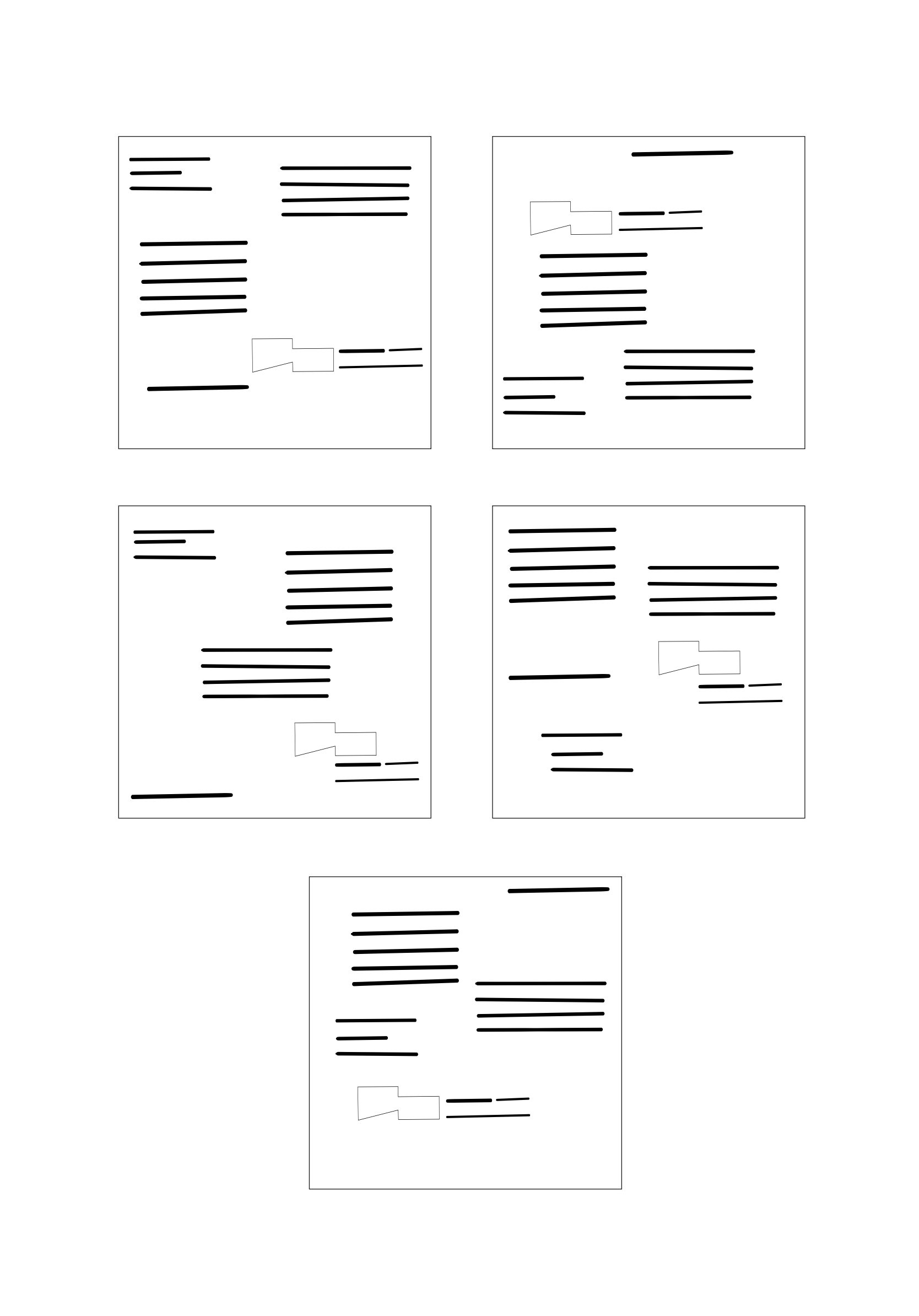
Sketches
For each section of the book I had to sketch different ideas for page layouts exploring one of the type fundamentals.
Brand Identity
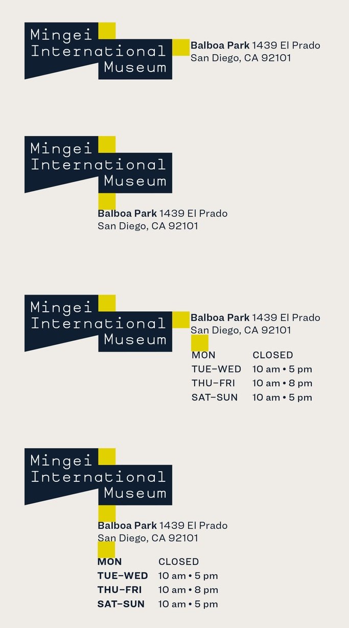

“This logo features Mingei Mono, a custom typeface designed for us by Yomar Augusto. Just like the objects in our collection, it is one-of-a-kind, hand-crafted, and designed for everyday use”
The primary logo was used for most communications, while responsive-shape versions were applied in design elements like patterns and image containers. These were reserved for cases where the audience was already familiar with the brand, allowing for more flexible integration without compromising identity. My role involved ensuring these standards were met throughout each project.


Color Palette
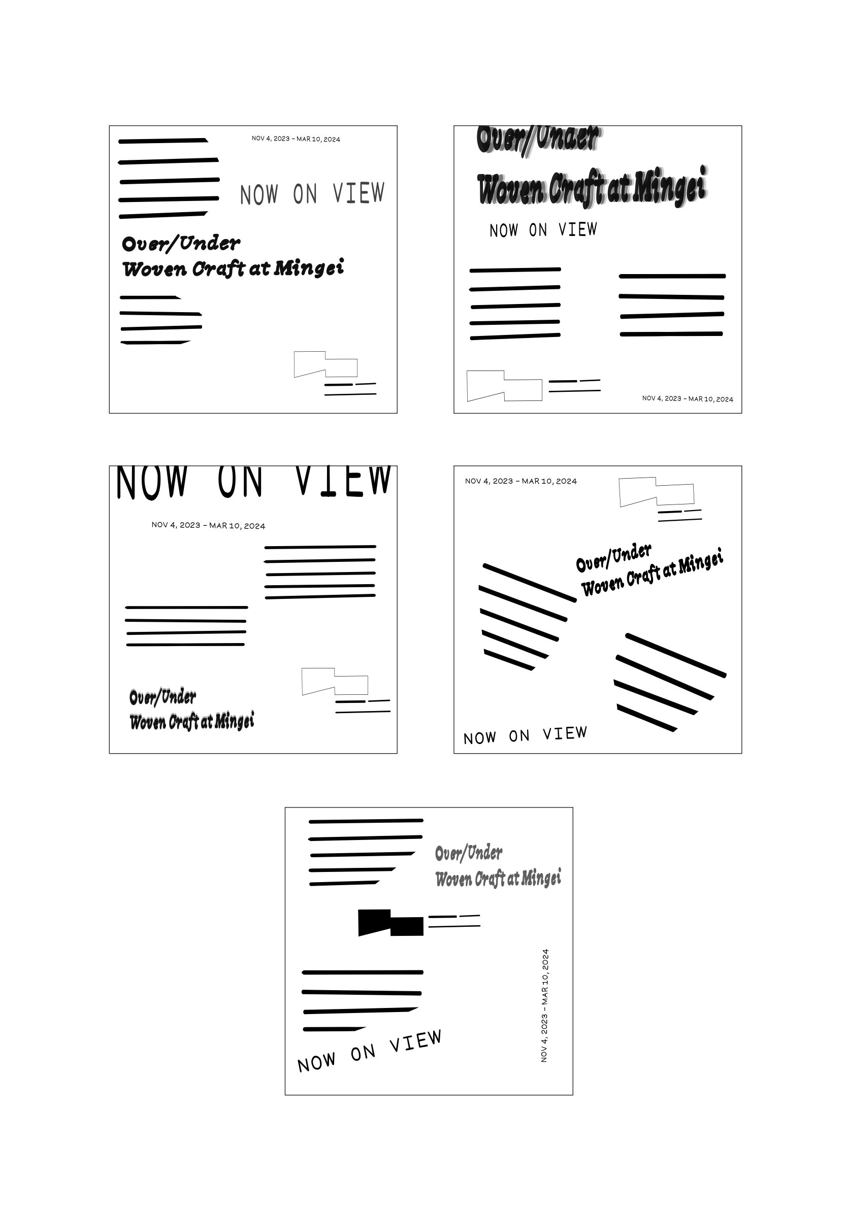
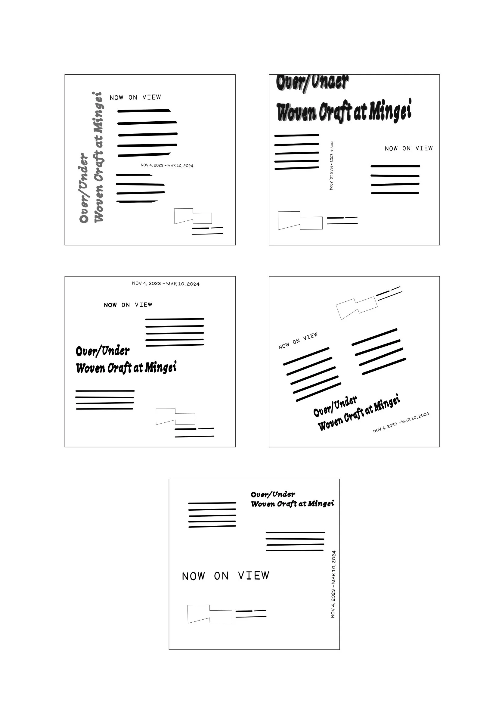
Layout Explorations